


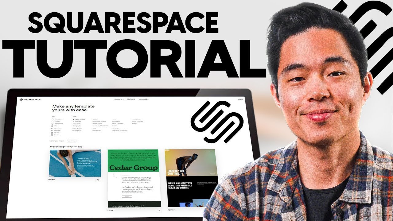
Building a website on Squarespace makes sense for small businesses, creators, photographers, service providers, and simple online stores that want one clean system. You get hosting, design tools, templates, blogging, and built-in site settings in one place, so you don’t have to piece together five different services.
That said, Squarespace feels easy only when the plan is clear. If you skip the planning stage, it’s a bit like decorating a house before the walls are up. You can do it, but you’ll likely redo things later. This guide walks through the full process, from mapping pages and picking a template to writing core pages, checking settings, and launching with confidence.
Start with a simple plan for your Squarespace website
Before you pick fonts or upload photos, decide what the site needs to do. A clear plan makes building faster, cheaper, and far less frustrating. It also keeps you from creating pages that look nice but don’t help your visitors.
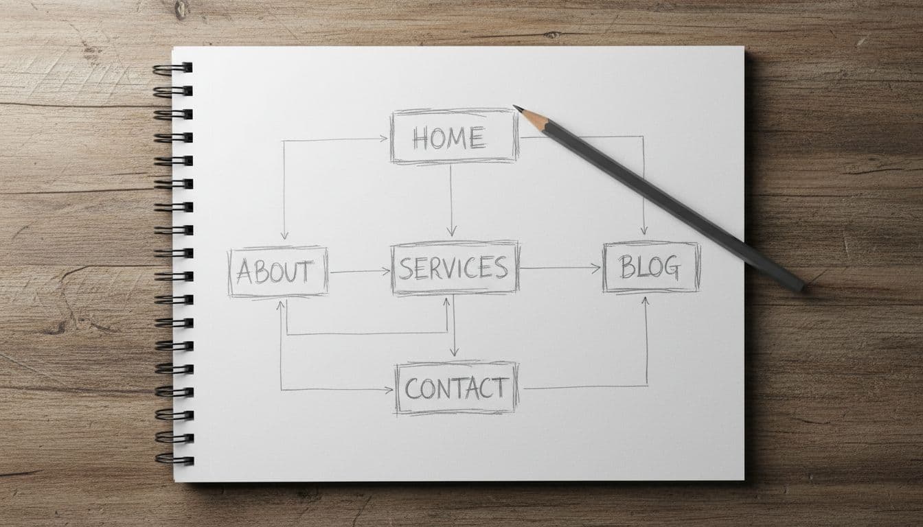
Most Squarespace sites don’t need a huge menu. In many cases, a strong setup starts with Home, About, Services or Shop, FAQ, Blog if you’ll use it, and Contact. That’s enough for most service businesses, portfolios, and small stores.
If you want a high-level look at what the platform includes, Squarespace has its own website builder guide. It’s helpful for seeing the basics before you start shaping your own site.
Choose the main goal of your site before you pick a template
Your goal should drive every choice. If you want people to book calls, your site should push visitors toward a scheduler or contact form. If you sell products, product pages and checkout matter more than a long About page. If you’re a designer, your portfolio should do the talking.
A few common goals work well as a starting point:
- Book leads: Focus on Services, testimonials, FAQ, and Contact.
- Sell products: Focus on Shop, product categories, shipping details, and returns.
- Show work: Focus on Portfolio, case studies, and a simple About page.
- Grow an email list: Focus on a clear homepage offer and signup forms.
If a page doesn’t support your main goal, cut it.
Sketch your pages and menu so visitors can find things fast
Once the goal is set, map the path a visitor should follow. A person lands on your homepage, understands what you offer, clicks to learn more, and takes action. That’s the core flow.
Keep the main navigation short. Five to seven links is usually enough. Put your most important page in the menu, not buried in a footer. Also, use clear labels like “Services” or “Contact” instead of clever names that force people to guess.
Pick a Squarespace template and make it fit your brand
Templates matter, but not for the reason many people think. The best template isn’t always the prettiest one in the demo. It’s the one that fits your content, your goal, and the way you want people to move through the site.
That’s why it’s smart to review page layouts before you commit. A blog-heavy site needs a different setup than a booking-based business or product catalog. For a broader beginner walk-through, this Squarespace step-by-step guide shows how different site types take shape.
Look for a template that supports your content, not just your style
Start by checking what you actually need. Do you want galleries, product pages, blog posts, events, or appointments? Squarespace can support all of these, but some templates make certain layouts feel more natural.
Look at the homepage structure first. Then check interior pages. A template with strong image sections may work well for a photographer, but it might feel thin for a consultant who needs space for service details, proof, and calls to action.
Use brand colors, fonts, and photos in a consistent way
Consistency builds trust faster than fancy effects do. Pick one or two fonts, a small color palette, and a simple image style. Then repeat that system across the site. When every page feels related, visitors relax. They know they’re in the right place.
Readability matters just as much as style. Use enough contrast, keep body text comfortable to read, and don’t overload pages with huge image files. Clean spacing helps too. Empty space isn’t wasted space, it’s what makes the page breathe.

Build the pages that help people trust you and take action
A good Squarespace site doesn’t try to say everything at once. Instead, each page does one job well. The homepage points people in the right direction. The About page gives context. Service or product pages explain the offer. The Contact page removes friction.
That’s the difference between a site that looks polished and a site that produces leads. If you want another practical reference while you build, this Squarespace setup guide covers the basics in simple terms.
Write a homepage that explains who you help and what to do next
Your homepage should answer three things fast: who you help, what you offer, and what to do next. That’s it. You don’t need to tell your whole life story above the fold.
Lead with a clear headline. Add a short supporting line that explains the result or service. Then give visitors one main action, such as “Book a Call,” “View Services,” or “Shop Now.” After that, build trust with reviews, client logos, brief proof points, or a few featured items.
The homepage is a guide, not a storage closet. If every section tries to carry equal weight, the page gets muddy.
Create About, Services, and Contact pages that answer real questions
Your About page should explain who you are and why your work matters. Keep it human. A short story, a photo, and a few proof points usually beat a long wall of text.
Service pages should explain what you offer, who it’s for, and what happens next. If you can share pricing, do it. If you can’t, explain your pricing approach. People want clarity more than mystery.
On the Contact page, give options that fit your business. A simple form may be enough. Some businesses also need email, phone, office hours, or a map. Set response time expectations so people know when they’ll hear back.

Set up the tools that make your Squarespace site easier to find and use
This is the part many beginners rush through. Don’t. Small settings shape how your site appears in search, how easy it is to use, and how polished it feels.
Add page titles, descriptions, and clean URLs as you build
Every page needs a clear title and a short description. Think of them as labels for search results and browser tabs. Keep URLs short and readable too. A clean URL is easier to trust and easier to share.
Use proper headings on each page, add alt text to images, and link between related pages when it helps the reader. For example, a homepage section about coaching should link straight to the coaching page.
Check mobile design, forms, speed, and basic site settings before launch
Most visitors will see your site on a phone first. So check spacing, image crops, button sizes, and line breaks on mobile before you launch. A page that looks perfect on a laptop can feel cramped on a phone.
As of March 2026, Squarespace offers four plans. All include hosting, templates, blogging, security, and basic site tools. If you’re mostly publishing content or showing work, Basic may be enough. If you want payments or stronger commerce tools, move up from there.
Here’s a quick view:
| Plan | Annual price | Best for |
|---|---|---|
| Basic | $16/mo | Blogs, portfolios |
| Core | $23/mo | Small business sites |
| Plus | $39/mo | Growing online stores |
| Advanced | $99/mo | High-volume ecommerce |
Annual billing is cheaper, and Squarespace includes a free domain for the first year on eligible annual plans. There’s also a 14-day free trial, which helps if you’re still deciding. For another current beginner walkthrough, see this Squarespace website guide for 2025.
Also connect your domain, upload a favicon, check business info, test every button, and send a form submission to yourself. Resize oversized images before uploading them. That one habit alone can make pages feel much faster.
A site that works well on mobile usually feels better everywhere else.
Launch your website on Squarespace with confidence and keep improving it
Launch day matters, but it’s not the finish line. A good website is a living asset. Once it’s live, you’ll learn what people click, where they drop off, and what questions they still have.
Use a pre-launch checklist so nothing important gets missed
Right before launch, slow down and review the details. A short checklist helps:
- Proofread every page for spelling, grammar, and broken formatting.
- Check every link in menus, buttons, and footers.
- Add legal pages if your business needs them, such as privacy or terms.
- Set up analytics so you can track visits and top pages.
- Test purchases if you run a store.
- Ask one friend to review the site and note anything confusing.
Fresh eyes catch problems fast. What seems obvious to you may not be obvious to a first-time visitor.
Update content regularly so your site keeps working for you
Once the site is live, keep it active in small ways. Swap in better photos. Update offers. Refresh testimonials. Review forms once a month. If you blog, publish when you have something useful to say, not just to fill space.
Also watch which pages pull the most visits. Those pages are your storefront windows. If a page gets traffic but few inquiries, the call to action may be weak. If nobody visits a page, it may need a better link from your homepage or menu.
A useful site beats a perfect one. That’s true on day one, and it’s still true six months later.
Building a website on Squarespace goes much better when you start with a clear goal, choose a template for the right reasons, write pages that answer real questions, and launch with care. You don’t need a flawless site right away. You need a helpful site that makes sense, builds trust, and gets better each month.